Responsive website design
CK Creative developed a responsive website for Brunskill Design, a London based architect firm.
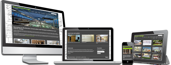
Brunskill Design are specialists in residential, conservation and transport architecture, and have designed breathtaking buildings for their clients. Due to the very bespoke nature at the heart of this business, they needed a website which was responsive, and in it’s own way bespoke to the user’s experience. A website that would resize and fit itself around the shape and size of the screen, whether that be a laptop, tablet or mobile screen. And boy did they get it!
 This responsive website displays differently on your mobile phone, laptop, desktop and tablet. Check it out, you can even try manually resizing the browser window on your computer and watching how this responsive website responds to the screen size to re-set and re-size itself accordingly. Pretty cool, huh?
With more and more websites being accessed via mobile devices this was the perfect choice for Brunskill Design, as it allows their users to quickly and cleanly navigate their website, no matter what device they are using. And for this architect website design, it is vital that the client has a clear pathway from the homepage, to the contact page.
The Website was built using WordPress CMS (Content Managed System) with an assortment of custom built code and plugins to enhance the features of the site.
We are crazy in-love with this website, Brunskill Design love it and we hope you do too : )
Website: www.brunskilldesign.com

